These are all of my portfolio projects that I began doing in many different classes since 2022 and since then I've updated, fixed, changed and made each one look better and professional for one of my classes.
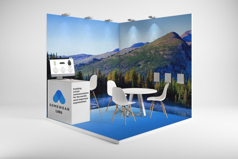
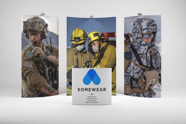
Trade Show Booths: For this project, I started doing it in a class called Exhibition Design with Craig Smallish, where we had to design our own trade show booths from a list of companies that he provided for us. We got to choose which company we wanted to make the trade show booths for. You can see from the photo, I picked somewhere labs, which is a company that provides Hotspots for people who travel, hike, camp, or maybe going to the Army, Etc. Creating a process behind this project was me thinking about the outdoors and how people mostly use hotspots Outdoors, so I figured I would add a mountain and Lakeview for the background, making it look natural, pretty, appealing, interesting, and concise.
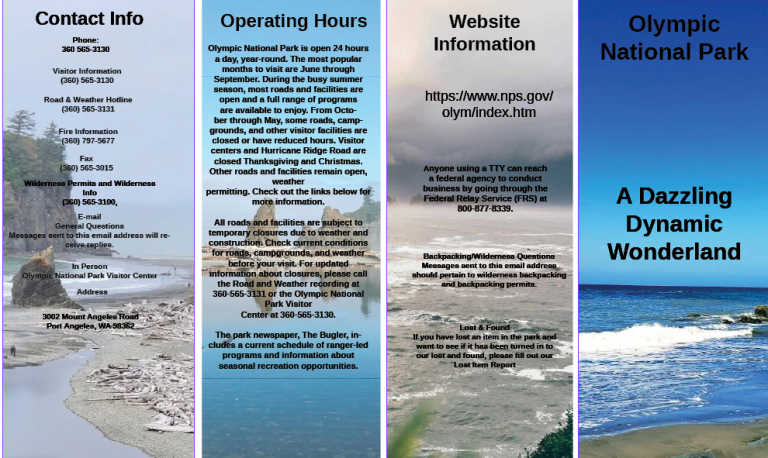
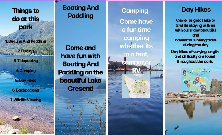
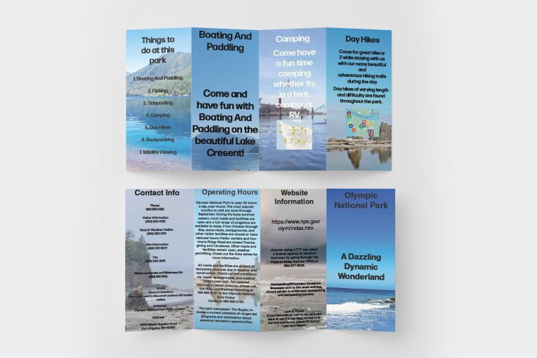
Folded Brochure: For my second portfolio project I did a folded brochure for limping National Park which I originally started to do in my typography class I was just say it didn’t end well so I redid it in portfolio assessment to make it look more professional, concise and perfect and I think it turned out well, and I really put a lot of effort and time into it. The creative process behind this was to make it appealing, interesting, creative, and consistent with the information that I found on the website. I decided to put all of the information on one page each for the brochure to make it look organized and consistent, and pretty.
Portfolio Night Next Gen: The creative process for this project was to get me thinking about hopefully a night at MATC and I decided to make the icons look really pretty and add a Galaxy theme to it to make it look futuristic for the Next Generation because you never know what’s going to happen with the Next Generation so I thought the Galaxy background would make it look futuristic as well as the icons.
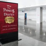
Movie Poster: For rhis project We got to do a movie poster of our choice in our typography class and for the creative processI chose this one because I love this movie and everything that it stands for and that it’s about I also got the inspiration to use the diary as a background for the movie poster because it’s significant to the movie and the book and they represents everything and this is how it turned out and I really love it.
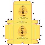
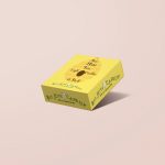
Beehive Candles: In this project, we got to do a Dieline for a company called Beehive Candles, and I decided to put a beehive with some bees on the box to make it look cool and interesting, and I think it went really well with the logo. I guess you could say the creative process flowed, and that’s where I got the idea to put a beehive on the box as well as bees to make it look cool, and it turned out really well, and I absolutely love it.
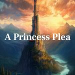
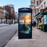
Short Flim Poster: For this project we got to pick a short film from the website Kickstarter and make a poster about it and so I decided to do a poster for the short film that’s called a princess play and this is a really fun project for me because I love fairy tales princesses dragons princes everything the whole shebang and I got really excited to do it and I guess the creative process behind it was when I think about fairy tales I think about castles and I decided to put a castle as a background for the poster and I think it turned out really well and I absolutely love it.
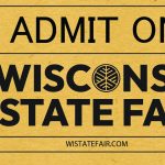
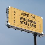
Wisconsin State Fair Billboard: For this project we got to do a billboard for the Wisconsin State Fair and the creative process behind this was it got me thinking about how people have to have tickets for the Wisconsin State Fair so I thought it would turn the billboard piece into like a ticket form and so that’s how it turned out and I absolutely love it and I got a hold of her from the teacher who showed me how to do it and I was really impressed and I love how this turned out.
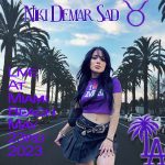
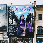
Niki Demar Poster: For this project I got to choose a poster and make it my own so for the creative process I decided to make a poster for a fake concert for Nikki Demar my one of my favorite YouTubers and make it look professional interesting appealing and cool and I found the inspiration for the purple because of her outfit that she’s wearing and I love the background and the text that I chose for this because I think it turned out really well.
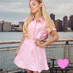
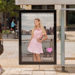
Gabi Poster This project I decided to do a poster for Gabriella demartino which is who is Nikki’s sister and also has a YouTube channel and I absolutely love her and our personality so I did a I made a poster for a fake concert for her in New York since she loves new American travels there all the time and I stuck to the outfit and the color that the outfit is which is Pink and I added pink and the NY logo and I absolutely love how it turned out and that’s the creative process behind it.
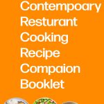
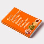
Culinary Book: For this project we got to do a culinary book for The Culinary class at a metc and I decided to put food on the cover of the book to make it look delicious interesting and appealing and I love the way that it turned out and I got the idea because I absolutely love food and I love that orange and how it turned out and that was the creative process behind it.
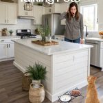
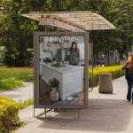
Talking Pets: For this project I got to do a poster where it would tell a story AKA movie and so I chose the title based off of The Secret Life of pets where the pets talk without their owners knowing and I thought like what would happen if humans could actually understand their pets so I came up with the idea of talking pets and a woman looking surprised because her cat just talked to her and I loved how the poster turned out and that was the creative process behind it.
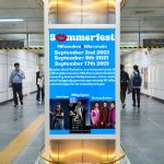
Summerfest Poster: For this project, I got to do a poster for Summerfest and include all the headliners that were there, and I absolutely loved how this turned out. I love the blue background, and I love that I spaced out all of the headliners and made the poster look cool and unique. And that was the creative process behind it.
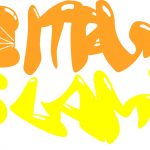
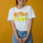
This last project that I got to do was for a company called Citrus slam which is a drink company and the creative process behind this was I love doing logo so I thought I could do like a orange as The letter c and add orange and yellow to it to make it look cool interesting appealing and professional and as a further worked on the project I thought I should make this look more fun so I played around with it and this is what I ended up with and I think it looks absolutely amazing and I loved how it turned out and that was the creative process behind it.
